Battle Creek’s new tagline capitalizes on fresh energy and positive momentum
“I think the beauty of this campaign is that we had so many of our community partners coming together. It really reflects our city and promotes a sense of pride, growth, and excitement."


Editor’s note: This story is part of Southwest Michigan Second Wave’s On the Ground Battle Creek series.
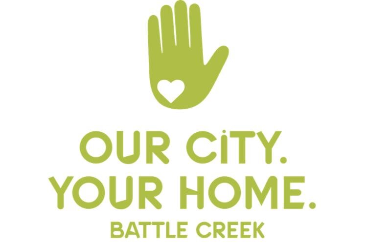
BATTLE CREEK, MI — Our City. Your Home. Battle Creek. is a new tagline for the city designed to capture the energy and positive momentum impacting everything from education to new investment, say those who had a hand in creating it.
The tagline and logo to use with it launched on Monday. The logo features a hand that signifies Michigan, and a heart to represent the love and location of Battle Creek.
“I think we have to look at not just our past but take a look forward,” says Charles Rose, a member of the Executive Design Team for the new tagline and a retired Kellogg Co. employee. “We are a community unified in many, many different ways. If you look at all of the connections, this is going to elevate the city and take it in a new direction.”
This was what leadership with the W.K. Kellogg Foundation was hoping for when they contracted with Ketchum Inc., based in New York City, to facilitate conversations with the city’s residents about what a new community narrative or campaign would look like.
Late last summer the work of listening and learning began. Members of the Executive Design team knew that community participation was and is paramount to the campaign’s authenticity and success. They spoke one-on-one to around 80+ community members (around 70 of those conversations occurred in Battle Creek) from diverse sectors and audiences, talked to 50 high school students at the Calhoun Area Career Center, 50+ business leaders, and entrepreneurs, students from Kellogg Community College, and did an online survey in English, Spanish and Burmese, which garnered 130 responses.
Everyone was asked similar questions to see if there were trends and many were identified with most people expressing a genuine love for the community and their answers as to why they love Battle Creek were very similar even though it was a diverse group of people from all demographics and walks of life.
With the community’s answers – in their own words—on why they love Battle Creek the narrative was drafted and from the narrative came the artwork. When people were asked to tell us 3 words to describe Battle Creek many showed us the Michigan hand map gesture and pointed to the location of our city.
“One of the things I brought up in our meetings is that a lot of decisions are being made without youth input,” says V. Word, Executive Director of the Arts & Culture Collective of Battle Creek.
Through a previous connection with Heidi LaGrow, Graphic Communications Technology Instructor at the Calhoun Area Career Center, Word asked if she could run the tagline and logo concepts by her graphic design students.
“They are young, creative people and I wanted to get some information from them,” Word says. “We showed them concepts and they voted on which tagline and logo spoke to them the most. We had some really good conversations with them about what’s meaningful to them about Battle Creek.”
“I have to say that the heavy lift came from Ketchum in terms of guiding us through the interview process with residents,” says Kara Beer, President of the Battle Creek Area Chamber of Commerce and member of the Executive Design Team. “We along with Ketchum interviewed residents. With our direction, they worked with a lot of different organizations and went into a lot of neighborhoods. They really listened to all of us from youth to the elderly and this tagline captures that.”
Those interviewed reflected the city’s diverse demographics across race, ethnicity, and age, including high school students, says Eric Greene, Vice President for Communications and Advancement at Kellogg Community College and member of the Executive Design Team. Those they met had varying opinions on many facets of the city, but all resonated with the common themes of family, home, and togetherness when thinking of Battle Creek.
Greene says the word that most comes to mind for him is “togetherness.”
‘
“Our city. Your home.’ tells me that this is our city and we think of it as all of us who live in or near Battle Creek or consider themselves to be from the Battle Creek area,” he says. “It speaks to ownership, pride, and community involvement. It says to anyone not currently in or living in Battle Creek that this can be your home. It’s an all-encompassing message that says everyone is welcome in Battle Creek.”
While this has always been an unspoken message in Battle Creek, the new tagline and logo raise its visibility and will be highlighted by various sectors in the community.
“I see this as an opportunity for us to promote our civic pride,” Beer says. “When you’re looking at a place to start a business or want to grow an existing business you look for that pride. With this new community brand, it really does depict that.”
The innate belief in the community and its residents encourages economic development and generates an investment portfolio for the city, she says.
“When we talk to companies — whether it’s a brand new company choosing to come here or an existing company looking to grow here — vitality and vibrancy is of vital importance to them,” says Heather Ignash, Economic Development Specialist with Battle Creek Unlimited.
The city is growing in the right direction with the attraction of new residents and businesses, Greene says.
“The potential is there to create this new story about Battle Creek and we want people outside of our city to see it as their home and a place to make a successful career,” he says. “A lot of young people want to quickly finish their education and move out of the community. We’re trying to share the message that you don’t have to leave to raise a family, start a business, and make a lot of money.”
Moving forward, honoring the past
Over the years the city has tried out various taglines, but the one that has had the most staying power is Cereal City.
At one time, Battle Creek was home to about 40 different cereal manufacturers. Kellogg and Post would outlast them all to become the largest and most well-known.
“Cereal City is our history and that will always be there,” Beer says. “Some people will always recognize that as who we are. The new tagline will bring our community as it is right now into a future state moving forward. As a nation, we have this housing crisis and we all need people and their talent to fill the jobs of the future. Creating a campaign like this is helpful to attract talent because of the sense of community pride.”
The 18 members of the Executive Design Team didn’t spend a lot of time debating whether the Cereal City tagline should continue to be used, Greene says.
“That moniker came about decades ago when the local economy was really driven by two or three different cereal companies. Our economy [today] is much more diverse. Firekeepers Casino is one of the largest employers. The new tagline is not going to be used to try to erase that history. That’s what put Battle Creek on the map. We are moving forward and looking forward to what’s going on in this community.”
Unlike the majority of taglines which are static leaving very little room for customization for those businesses, organizations, and individuals using it, Our City Your Home. Battle Creek is an Open Concept designed to be tailored to fit the needs of those using it.
Some marketing experts may consider this a major leap of faith, but the Executive Design Team members say the tagline is the direct result of community input and the community owns it.
Ignash says the strong agreement experienced shows a universal pride in “our city. I love the fact that we are all able to come together and create something together to have this united front. It gives this sense of ownership that we’re proud of.”
“This makes us stand ahead of others because of that open concept,” Beer says. “Our group really wanted something that felt like it didn’t hamper someone’s creativity or take away their brand, but was really an enhancement.”
“The artwork and taglines were purposefully designed to evolve, adapt, and extend to your own project needs,” according to information in Usage Guidelines developed by Ketchum. “Everything is open to artistic interpretations. Play with the design and see what you can come up with!”
The Usage Guidelines include examples such as “Our City. Your School. Learn and Grow in Battle Creek” with a graduation mortar board in place of the heart and Our City. “Your Brew. Hop Explosions in Battle Creek” features a mug of beer over the hand.
Compared to other taglines the city has had in the past, Word says this one feels unique and relevant to what’s going on in Battle Creek now. She says there’s been plenty of discourse about who lives here and who doesn’t and who works here and who doesn’t.
“This is a statement that we’re all together. I think it’s good to have a visual representation of the city,” she says. “In the past, people have struggled to connect with City Seal and other visual marketing things and this logo is something that can be changed and personalized. We have so many things going on here and you can’t just have one thing that is static. Hopefully, the arts community will use it and make it their own.”
In addition to examples of the different ways the logo and tagline could be used, the Usage Guidelines include four options for 30-second Elevator Speeches are offered on the website, including this: Battle Creek is a place that really values community. It’s the best of small-town grit and big-city drive. It’s a vibrant city, expanding with opportunities, that still manages to have a close-knit, small-town feeling.
Ignash says a toolkit that Ketchum put together for those who use the tagline is easily adaptable and provides a seamless rollout.
“I think the beauty of this campaign is that we had so many of our community partners coming together,” she says. “It really reflects our city and promotes a sense of pride, growth, and excitement. When you’re attracting new businesses and they see a community with so much pride, it’s important that they see this vitality. They want a great place to invest in for their employees to live. We want to show companies that this is Battle Creek.”
The toolkit and usage guidelines are available on the Chamber of Commerce website and went live on Monday, August 5.
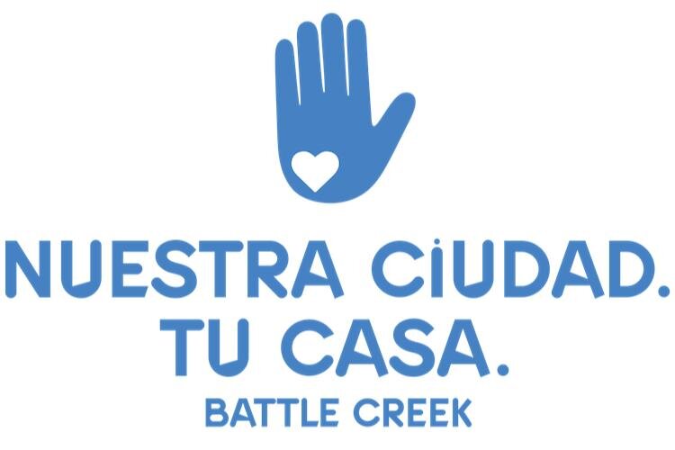
In addition to English, Beer says the information will be available in Burmese and Spanish.
The tagline campaign presents opportunities to fill voids that social media has left, Greene says.
“Comments and posts on social media don’t tell the whole story about a community,” he says. “This is a campaign that looks forward to what the community can be and recognizes what the community is already and that it’s a pretty darn good place,” he says. “One of the things we heard from people around the community is you don’t have to live a cookie-cutter life here.”
Author

Related Articles
How a small Quaker Meeting has helped shape Kalamazoo for nearly 80 years
In Kalamazoo’s Douglas neighborhood, the Kalamazoo Friends Meeting blends silent Quaker worship with decades of local activism, from peace advocacy to community care at Adda Dilts Peace Park.

Maid in Battle Creek expands into (Maid in) Kalamazoo
Maid in Battle Creek has expanded into Kalamazoo, growing from a local startup into a two-city cleaning company with a team of employees, commercial and residential clients, and a continued focus on personalized service.

Great Lakes, local consequences: Indigenous voices on why Line 5 matters in Kalamazoo
In Kalamazoo, Indigenous students and leaders are mobilizing against Line 5, perceiving its threat to regional watersheds and a clash with values of long-term environmental stewardship.